Blog
4 Responsive and Awesome Web Design Trends This Year
The way people use the internet and websites is constantly evolving. More people are using mobile devices to interact online compared to desktop, pushing web designers to maximize the experience for everyone, no matter what device(s) they choose. Here are some web design trends that use responsive design.
- Use of Images over Text
Solid copy reinforces the message on any website and remains invaluable for SEO. But if you can say what you want with a photo, infographic, animation, or short video, then do so. In a world where we take over 300 billion photos a year, it comes as no surprise people want image heavy content. Visual-based social media networks Instagram and Pinterest are in the top four most used networks along with Facebook and LinkedIn. Images are also easier to comprehend on smaller screens. It’s not always solely one or the other though. Articles with relevant images get 94% more views, so it’s still a good call to pair visual and written content. Just make sure you’re sharing your ideas in an accessible way.
- The Long Scroll
“Above the fold” doesn’t mean anything on mobile devices. Once considered bad design, mobile’s proliferation has made the long scroll relevant. It makes navigation easier by eliminating clicks and gives each section a different visual design, making what could have been a tedious journey, fun. The long scroll gives the opportunity to take a narrative approach and engage users at different steps. If you do choose to send your users on a mission however, they will expect a payoff.
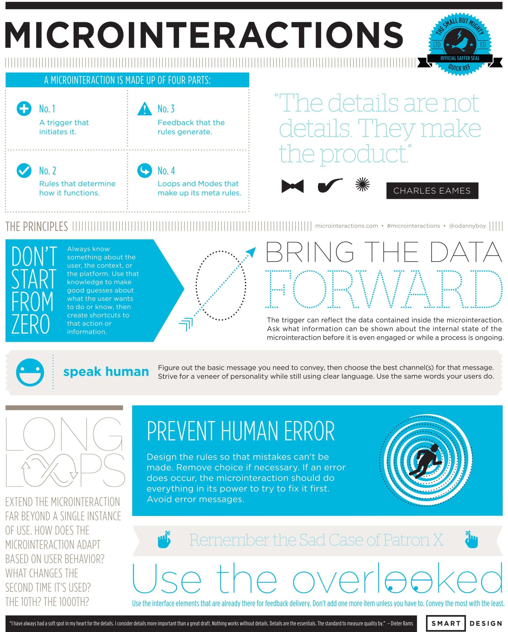
- Microinteractions
While the word “microinteraction” might be stepping too far into buzzword territory, it describes a way to interact with an intuitive website. Facebook was on the forefront with their “Like” button, but everything from “Pinning” to one-click buying falls into microinteraction territory. If they’re done wrong it can be frustrating for users, but if done right, they bring a certain ease of interaction. To get the most out of employing them, check out Dan Saffer’s Microinteractions: Designing with Details cheat sheet.

4. Push Notifications, for Desktop
You know how well push notifications work. No matter where you are, that light, ping, or buzz coming from your phone demands your attention, however briefly. Many developers have begun to bring that sense of urgent interaction to their desktop interfaces. Usually a sly modal window quietly asks for your permission. It makes sense of course, you’re on the site, clearly wanting to engage. Right now they’re a little too quick on the draw though. It is hard to say yes to further engagement before you’ve really interacted the first time. Hopefully this technique will find find it’s groove and actually be helpful.
This is by no means an exhaustive list of current trends, but hopefully points you in some interesting directions as you make your own design choices.
